Friday, April 27, 2012

Last Tag

 For my last tag share (for now anyway), I did some thing a little different.  I've been wanting to try this mosaic technique found here on Sensei's blog, but did not have the proper supplies till now.  I thought it was soooooo cool how he made the butterfly look like a mosaic.  Well, I finally got my hands on some wonder tape and grunge board, so I was free to work on this project.  The link above has a whole tutorial on how to do this technique.  Of course, I had to put my own spin on it, right?  Instead of regular DP, I used washi paper and instead of cement embossing powder I used black.  It reminds me of those black laquer boxes you find in Japan.


The branch stamp is by PTI and the sentiment is an old Paper Inspirations stamp. I'm pretty sure they went out of business. I wish they were still around though as I love their stamps!


Here's a close up of that mosaic butterfly.  I think I need some practice in fitting in those pieces.


I'm all tagged out for now.  Be back soon with another mini album project!


Thursday, April 26, 2012

Painting on Tags (Gasp!)

OK so it's not really painting, but it's kind of painting!  Tracy must be laughing at me right now if she's reading this post.  She knows I avoid paint as much as possible.  Not sure why, but a paintbrush seems so awkward in my hands.

Luckily, I didn't have to use a paintbrush here!  Yay! 


This first tag used paint daubers.  Love it!  I thought the applicator would dispense too much paint onto my stamp, but it didn't.  I used gold paint on my Hero Arts script stamp and stamped it onto the tag.  Then laid some stain over it after it dried for a paint resist technique.  Holtz Sensei is such a genius I tell you!  Then I stamped the Hero Arts dandelion stamp using Archival Ink and finished the edges w/more Distress.


This next tag got a little busy.  I guess I felt the need to use up all that space!  This is the crackle resist technique, but I used the Rock Candy crackle paint instead of the regular Distress Crackle paints.  Since its clear, I distressed the tag first.  Don't know if you can tell, but I had some crackle difficulties on the lower part!  Oh well, gotta keep practicing I guess.  All stamps on this tag are by Hero Arts.


This last tag was done using the Shattered Stains Technique.  Tracy always talks about grunge board, so I ended up buying some since Holtz Sensei uses it in a lot of his projects.  This one was fun, but I wish I had more colors to play with!  Butterfly die is by SU and stamps used are by Hero Arts and Stampers Anonymous.

Here's a close up of the butterfly...


I think I have one more tag to share with you tomorrow.. See you soon!

Wednesday, April 25, 2012

Getting Messy w/Creative Chemistry

 OK- I'm not the neatest crafter... Ask my husband!!!  Yes, you can't see the top of my craft table, I do many tasks on my lap instead of on the table, and I rip my double stick tape instead of cutting!!  (I can see Cami and Kyoko cringing as I write this!).  But when it comes to crafting, I had a hard time letting my project look messy.  These tags were all made using some form of Perfect Pearls and I'm surprised that my tags came out looking like this.  I use mica powders a lot in my projects- they give a great subtle pearly/metallic glow that is not overpowering like if you emboss.  This time, I allowed myself to be as messy as I could to try to achieve the same look as Tim Holtz's tags. I think mine came out much more messier than his though.


Tag #1 is Distress sprays with Perfect Pearls added in.  I gotta say, this came out much nicer than I expected.  I tried to position the camera so you could see all the gold that was added via the spray. I mixed Vintage Photo w/water and gold PP.  Also mixed Broken China and gold for the blue areas. Then dried my tag and went around the edges with more Vintage photo.


Here's where I started getting more messy... This technique is called Perfect Distress. It's a bit hard to see, but I did try to get a good angle so you can see the pearly hue on the image.  You stamp w/Distress inks and then add a layer of PP, then spritz.


Here's where I get really messy... This is called Perfect Splatter Distress Technique.  Guess I got carried away with the "splatter" part!  Don't know if you can see too well, but after I had fun getting inky, I stamped the tree and went over it with more PP.  Then added a sentiment to finish up the tag.


Totally happy with my PP purchase!  It's great since it sets w/water, so it won't rub off your card like regular mica powder does.  More to share- check in again soon!

Stamps are by PTI and Stamper's Anonymous.  All ink and PP are by Ranger. 

Tuesday, April 24, 2012

Getting More Inky

 Three more tags to share today.  For some reason I found the first two tags really challenging.  Had to wait until my Archival Ink pads arrived before I could play with these inks.  I never knew what the main differences were in the different inks before, but now that I do, it makes stamping so much easier!


The first tag was made using alcohol inks.  I think this is my best alcohol ink background, which is why I used it for my sample.  For some reason, I had a hard time achieving the same effect as Hotlz Sensei.  I'm glad the photo picked up some of the gold that was hiding.  After I did the background, I just stamped over it using my black Archival ink pad.  These are becoming one of my favorite ink pads!


This 2nd tag was also challenging.  I had to re-play the video several times to understand what Sensei was saying.  I guess I never thought you could do a resist technique just using inks and no embossing.  This Archival Ink resist technique was done using Archival Inks (light colors) and distress inks (supposed to be dark).  I think I should've used a darker distress ink color for the background.  I'll admit, I was chicken.  I didn't have the guts to go darker, but I'll try doing so next time.


This last tag was playing around with my new water brushes.  After stamping w/Archival inks, I used the waterbrush to paint the images.  Used Tumbled glass on the leaves and one of the browns (sorry, I forget which one!) on the kanji.  I thought it was cool to color it in so that it looks like I punched it out and adhered it to the tag, but really the kanji was stamped directly onto the paper.  BTW- used watercolor paper for this technique.  Don't frustrate yourself like me and use regular cardstock.  Waterbrush + Watercolor paper + Distress inks = Happy Me!


Be back soon with a few more to share...  Have a great week!

Sunday, April 22, 2012

Creative Chemistry- Embossed Tags

The joke around my house now is that my other husband is Tim Holtz!  Yes, I do spend quite a bit of time with him and his Creative Chemistry videos, so my husband jokes that I'm having an affair with him.

So one day Creative Chemistry focused on distress embossing.  I wasn't able to do one of the techniques because I don't have the Distress Embossing Power anymore. I had it once, but I think I might've sold it (gasp!). I remember trying it out and not liking the results too much.  So I'm torn if I should get it or not. Any thoughts on using distress embossing powder out there?


So instead, I just used my regular embossing powders.  The first and last tags are pretty much the same- both using the emboss resist technique, then stamping over it. I'm having fun playing around with different color combos.  The middle tag is a method called Rusted Enamel Technique.  That one was new and fun for me... You emboss the entire tag!  Never thought of doing that before.  I'm laughing cause you can see the gouges I did  with my finger... definitely not as smooth as Professor Holtz!  Gotta try this technique out again. Stamps are by Hero Arts and Hanko Designs.  Later alligator!

Saturday, April 21, 2012

More Creative Chemistry!

More tags to share today!  This time I played with my new Distress Markers!  I would best describe them as a water based version of copics?  Or maybe a watercolor pencil marker?  You can use them in so many ways, but I think the best way I like to use them is to pick up the ink from a craft sheet using my new waterbrushes.  You get a real watercolor look to them when you do it that way vs. coloring directly to paper.  I guess I feel like I can get the intense color using my Copics, so to get this type of effect is new and exciting to me.


The flower tags are just me playing around with it. You are supposed to write your notes on what you did to get that look, but I forget!  ha ha ha! Guess I'm not a good student. I do remember what I did on the middle tag though.... That's stamping using the Distress Markers.  You can go directly from pen to stamp and colors will blend nicely if you overlap.  I've been seeing some samples lately and wasn't sure if I liked the results, but I'm a believer now!

I have more to share on Creative Chemistry, so check in again soon...

Friday, April 20, 2012

Happy Aloha Friday!

I guess waking up early has its advantages!  I am able to get this post up before going to work.. yay! It's been a long week and I'm so ready for the weekend!   I've been working on a lot of projects lately.. getting ready for classes, coming up with new craft fair projects and catching up on my Creative Chemistry class!  I finally got in most of the supplies needed to do the projects in the class, so I spent most of Saturday and Sunday getting inky.

Here's three tags using the Distress Stains.  The first one is using it on the kraft resist paper.  I don't know if you can see, but its actually the Christmas paper since I didn't have the regular one.  Oh well, put another thing on my list of stuff to get.  Anyway, using the stains is so easy!  I'm getting the hang of it slowly and getting better results.


The second tag is a technique stamping with stains.  I distressed the background first, then used my Picket Fence (white) stain to stamp a word background (Stamper Anonymous).  As it dries, it gets more opaque looking.Then I stamped the other stamps by Hero Arts.  Call it luck, but I was quite happy that my Eiffel Tower got such great placement over the blue!  :)

The last tag was done using a marble stain technique.  Again using Picket Fence, I marbled it with Broken China, Peeled Paint and Crushed Olive.  Then I added some Vintage Photo and Blue Jeans around the edges.  Couldn't wait to use these new Hero Arts sets by Basic Gray.  Love them!  Now that I look at it, its hard to see the marbling technique in this photo.

Just want to say thanks to my girl Linda for the tags!  you rock!  I gotta go get me some more soon!  Have a great weekend!

Tuesday, April 17, 2012

New Obsession!

Yes, I confess.  I have a new food obsession.  My last obsession was frozen yogurt, but now that obsession has faded and I'm now into CUPCAKES!  Yes, I know, I'm behind the times, but hey... I live in Hilo.  We are always behind the times.

So my obsession started with my cousin Laura's visit to Oahu.  My Aunty and I took her craft shopping and she asked if we could stop by a cupcake shop called Let Them Eat Cupcakes.  She really wanted to try the mochi cupcake, which had a piece of chi chi dango inside the chocolate cupcake covered w/ganache.  I was intrigued, so we placed an order to hold some for us... and good thing we did!  They had sold out, so luckily they kept a few for us.  It was pretty good- very creative to put a piece of mochi inside.

After that, I went to LA and while visiting my brother, my sister and I saw a cupcake place next to Starbucks.  I had cupcakes on the brain, so later that day, we had a few minutes to kill, so I dragged my sister back to Bubba Sweets for some cupcake goodness.  I gotta say, we shared a cheesecake cupcake and it was awesome!  It had a thin layer of sugar that crunched when you bit into it.  Love it!  Definitely want to go back the next time I go to visit.

I already talked about 2 other cupcake places we tried while in LA... you can read about them here..

My friend Debi surprised me with some Hilo cupcakes by Jocipops.  Not bad.  I think you have to pre-order them- no shop to go visit.

Larry's Bakery is another one of my favorites... Their red velvet cupcakes are pretty darn good!  What am I saying... all of their cakes are good!

Our friend Lani brought us back some cupcakes to try from Hokulani Bakery. They just recently won cupcake wars, so I had some high expectations. It was pretty good, but...

But my new favorite when I go to visit Honolulu is Cake Couture!  Here's a pix of what I picked up for our Easter Brunch dessert... Are you drooling yet?  I am.  (wiping my chin).  I gotta say, no matter all the flavors I've tried, my favorite is still the CHOCOLATE HAUPIA.  I can't help it... its not that sweet, which is just how I like it. 


Ok so now that I've gotten that off my chest, I feel so much better!  Thanks Laura for starting me on the cupcake kick.  I'll be back soon to share more Creative Chemistry tags.  Have a great week!

Thursday, April 5, 2012

Serenity

 Woo Hoo!  Three days in a row!  Are you still there? Did you faint yet?  Yes, its no joke, I did post three days in a row- amazing yah?  See!  I told you I'd try harder to be a better blogger!  Ok enough patting myself on the back...

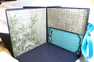
So this project features another new set of papers that I'm in love with.  Its a new line by Bo Bunny called Serenity.  Love all the coordinating papers and matching embellishments!  Totally takes the guess work out of scrapbooking.  I like this line so much, I'm finally making my Japan trip album using these papers!  I'll share those once I finish them- right now they are half finished.

I decided to do another pop up scrapbook using these papers. Pop up scrapbooks are such crowd pleasers right?  Well combined with these papers, I'm sure the recipient will love it!


This is my last project for now, so hopefully by the time you read this I will have finished another project in time to post.  We'll see!

Wednesday, April 4, 2012

Simple Stories Mini

Here I go again!  On a roll now with posting my projects... Yay! And definitely on a mini album roll if you haven't noticed.

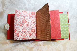
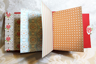
I literally fell in love when I saw these papers by Simple Stories at CHA and could not wait to get my hands on them!  I wanted to steal them from the display booth, but I kept my composure and hoped that I could find them in a store while I was in LA.  Well, had to wait till I returned home to get some, but I was so happy to see them!  These colors are just screaming "Jenny, Jenny, come buy me!" ha ha ha.  So I did.  I'm weak, much weaker than my friend Linda (aka "Kimmie").  OMG- just linked up Kimmie and saw that Linda likes her on FB!!! bwa ha ha ha! I knew it!

Ok back to the mini... Made another of those cool double pocket mini scrapbooks again cause its just so much fun!  So much pockets to fill journaling, photos, and other fun stuff.  Took pix of all pages- enjoy!


Hope you enjoyed it!


Tuesday, April 3, 2012

Happy Birthday Debi!

 As most of you know from reading my blog, Debi is my CBFF!  Yes, I made up this term because I think that these crazy acronyms are so funny, so I made up my own.  C-Crafty BFF!  I have other BFF's but she is my craftiest.  She's my go-to gal whenever I'm stuck on a project or have a question on technique. All I can say is I'm so happy she moved to Hilo!

So since we've been friends, I've taken her out for her b-day.  It's our chance to hang out and have some girl time.  This year, I was inspired to make something for her.  She's been helping me out from Day 1 of Sister Stamps and I really really appreciate all her feedback, samples, and other help she's given me.  Ok, I'll stop gushing now, but you get the idea.

I thought a mini album would be fun to give her since she could use it for whatever.  I got this paper pack during the Sale-A-Bration from SU this year and remembered that Debi told me that she liked the paper, so I decided to use it to make her mini.  The great thing about coordinated papers is that it takes the guesswork out of putting together a mini album!

Debi tends to like country vintage/shabby chic style crafts in addition to cutsie.  I guess its rubbing off on me cause now I'm liking that too. I added some flowers and bling to the cover, but left an open space so that she could put her own title if she wanted to.  I wasn't sure what she would use the album for, so I left that blank for her to play with.


In my first mini waterfall album, I only made the waterfall on the right hand side.  I wanted to do something different this time, so I made the waterfall on both sides so she could add more photos and journaling.  


This next photo is when you pull the left side.


And this is when you pull the right.  Obviously you can't pull both at the same time or they will collide!


Hope you enjoyed this mini, but more importantly, hopefully Debi likes it!  Waiting to post this until I can give it to her.